Defining the Future
Of Typography
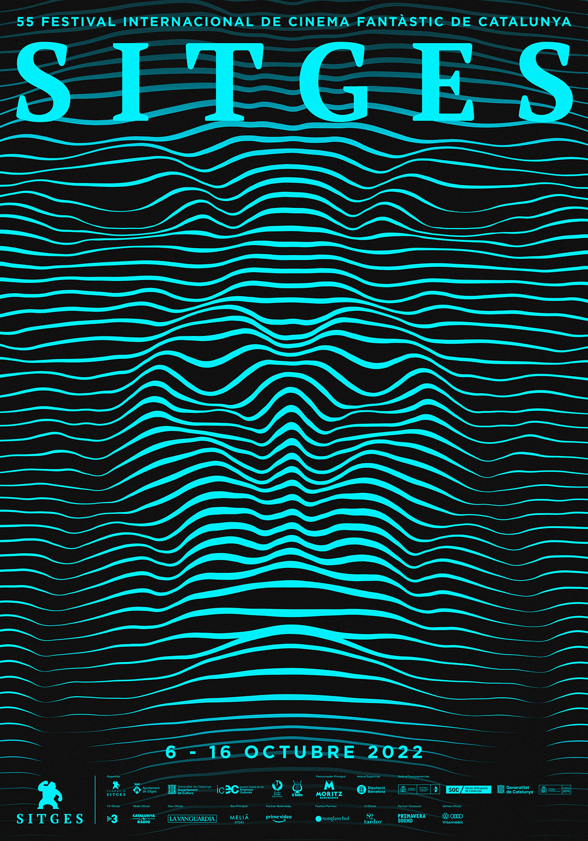
Sergi Delgado's most popular piece of work would be his poster design for the Sitges International film festival in Barcelona. His work really pushes the notion forward of how typographical properties can be bent to create visually appealing artwork. The festival in Barcelona mainly focuses on movie genres like horror or something derived from fantasy, so it would make sense to further that demographic by using an artist that is also expressive and experimental.
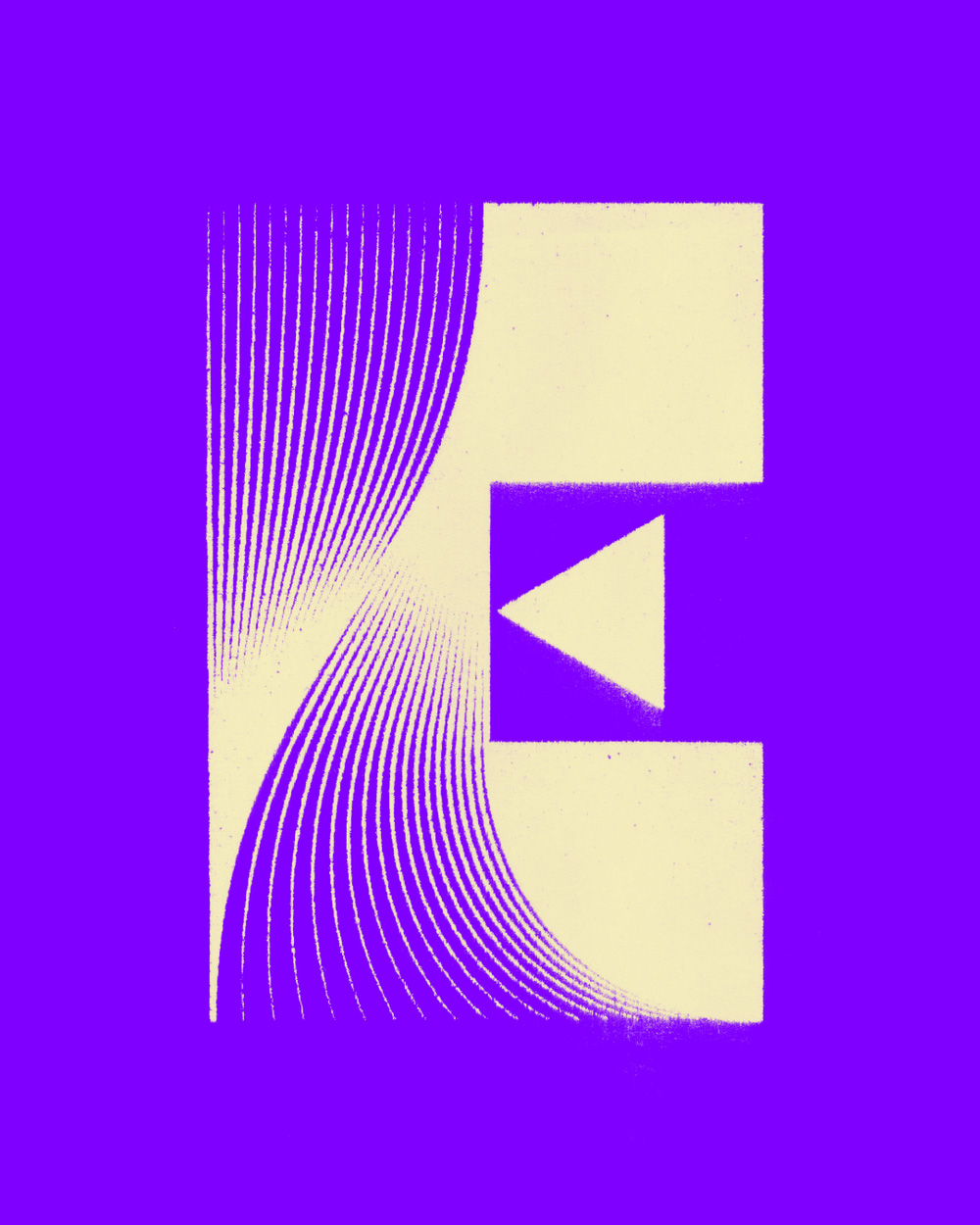
In the poster, the typography becomes the artwork, not the artwork itself. He uses lines within his artwork to direct the viewers eyes around the page, creating a dynamic and moving picture. The letterforms of this project are serif letters, and their structure is reflective of the modern typeface family. The letters flow nicely across the top of the advertisement and the design underneath creates an immersive visual experience.
This project of his really enhances how typography can be pushed to be more expressive and how typography can compliment other graphics within the piece. Despite the loudness of the lines and colour choice within the poster, the typeface chosen excellently compliments the visuals by not being too loud, and being just the right size for the intended project.
Typographic Work of Sergi Delgado


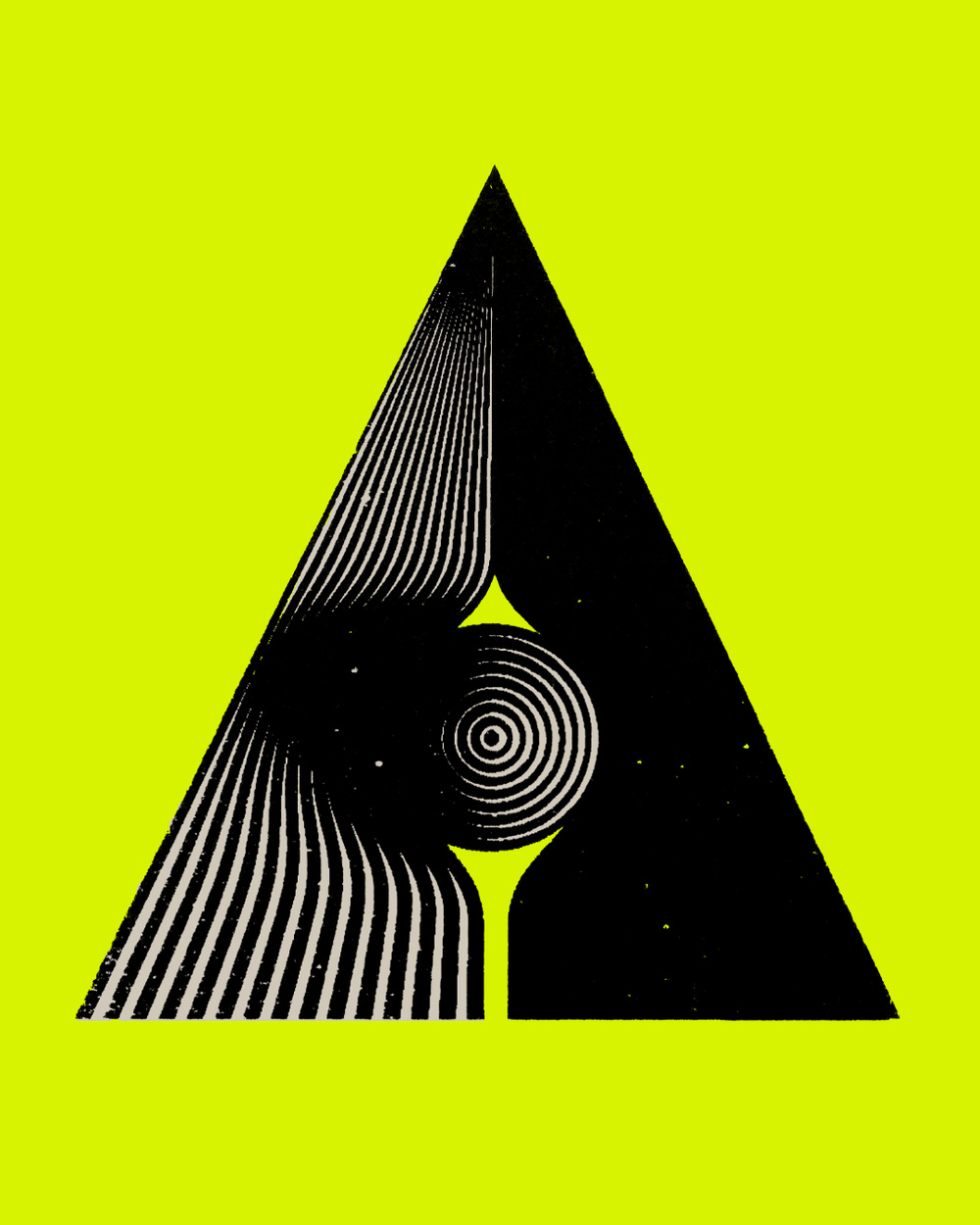
One of his typefaces is structured so as to form an optical illusion. The use of grids and colours within the typefaces offer a structured-looking approach, but the letters are also dynamic and provide movement. He more so focuses on creating a visual experience for his viewers. His letterforms are seemingly 3 dimensional and this causes the viewers to interact with the pieces. in terms of structure.
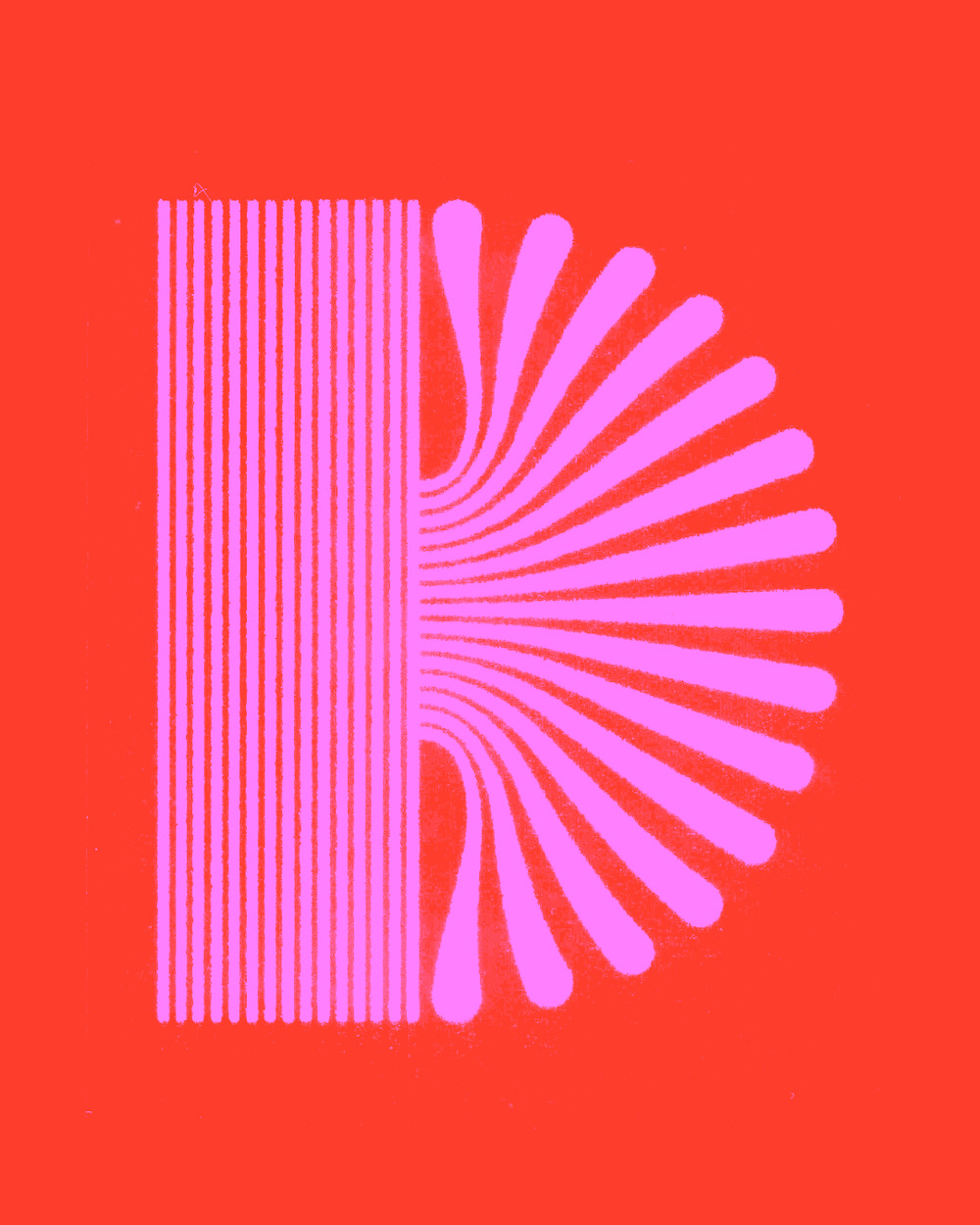
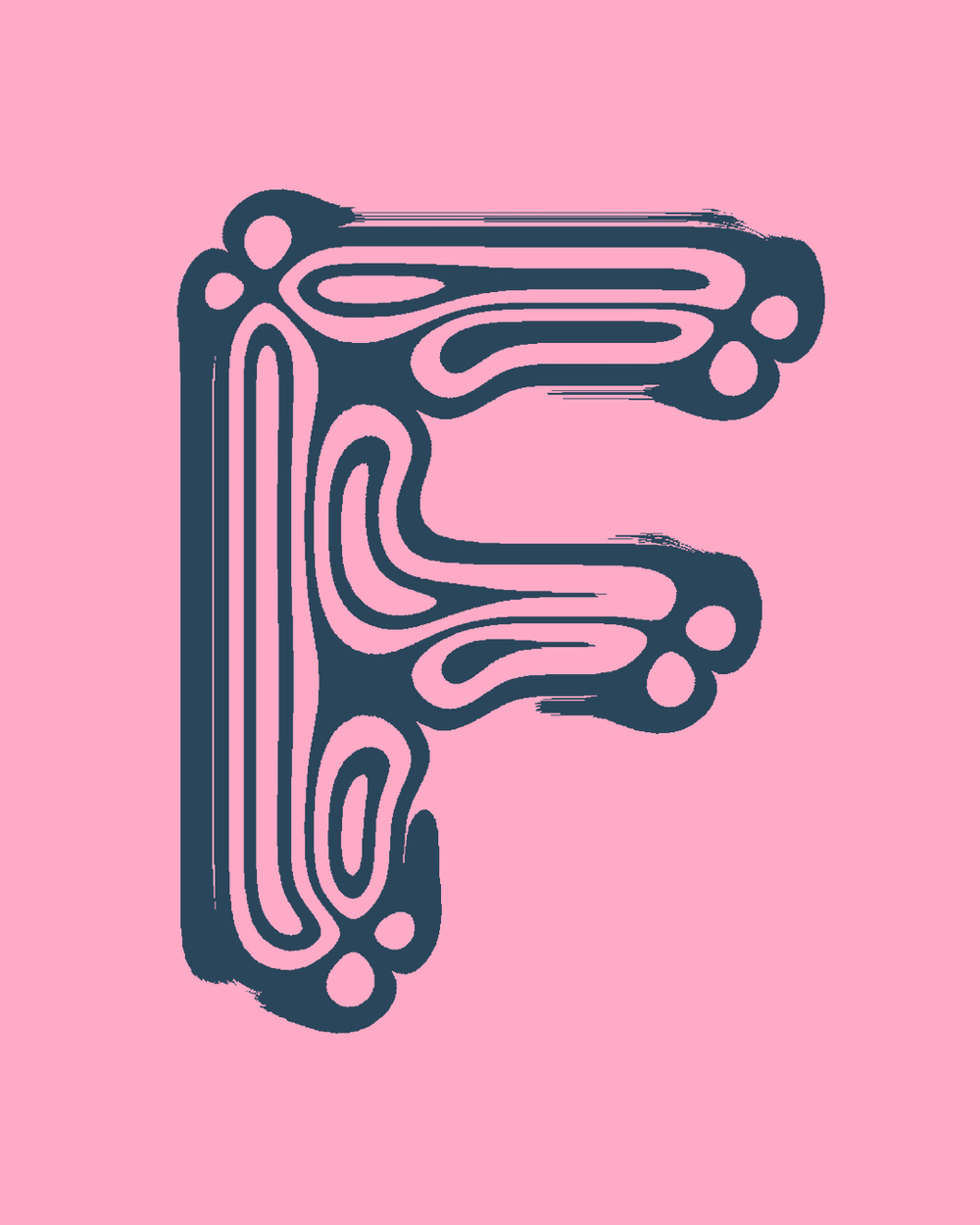
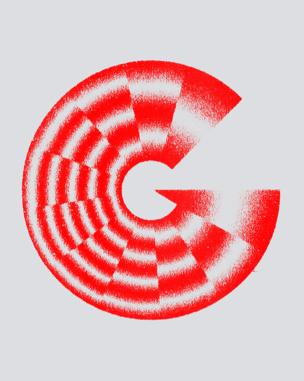
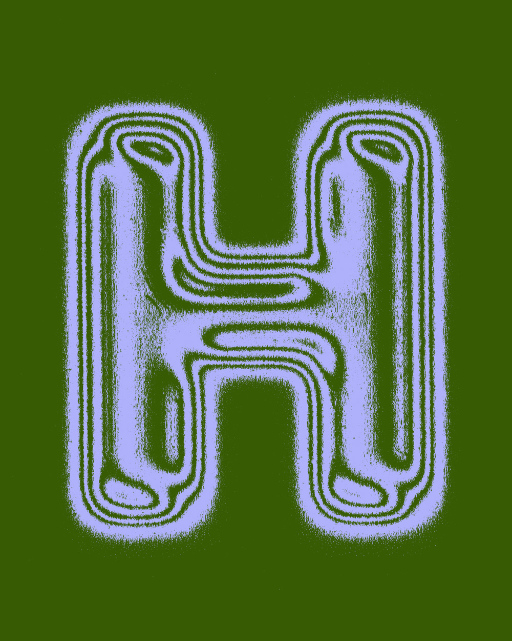
One of Sergi delgados typefaces is from the 36 days of type challenge that he conducted in 2023. He uses lines and grids within the letterforms (both seen and unseen) to show structure. One might think that the use of rigid grids would decrease the dynamic aspect of the letterforms, however the letters are actually full of movement with vibrant colours and almost distorted letterforms.
Delgado's approach for these sets of letters in terms of font family and serif, he actually goes in more of an experimental direction. Their shapes and letterforms are defined by blurred lines and the use of colour. Although there are no direct serifs, the forms of the letters and the use of the lines are intended to be dynamic and help the reader follow across the page. the lines don't end in stark, shocking formats, but they soften as the terminals close making the form feel continuous rather than static and fixed.
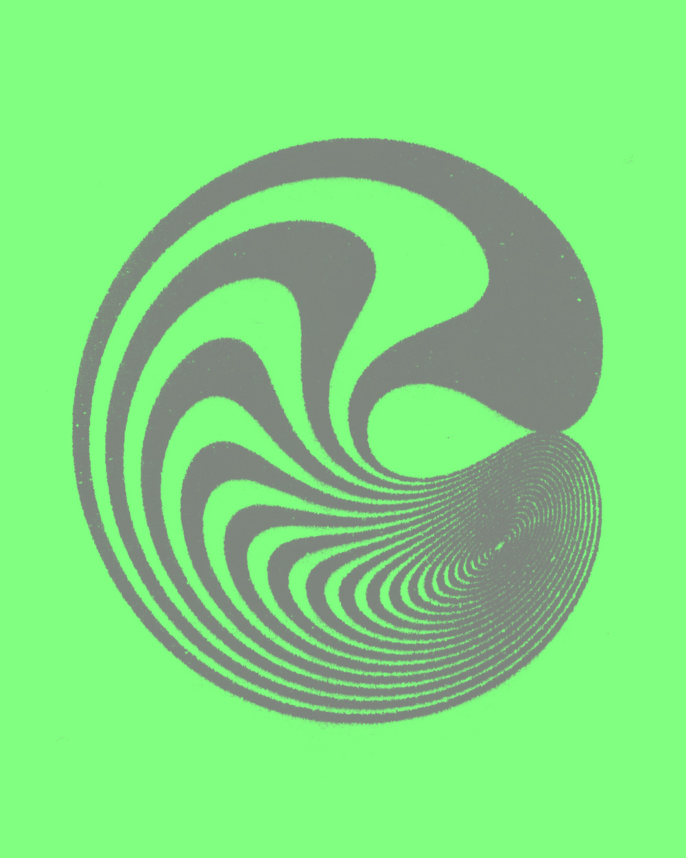
Each letterform in this section of his typeface relies on using repetition within the lines and forms. There are strokes within the letters, making the viewer's eye travel with the letterform and this creates the letters dynamic nature. Delgado shows his process work on his social media applications like Instagram, Tiktok and LinkedIn, and shows how typography can become experimental.